Rick Dangerous for iPhone – UX review

The period from 1987 – 1990 was a golden era of gaming for me.  I was 14 years old, so I had plenty of spare time, had a Commodore Amiga, and had access to a large collection of games, not all exactly legal to be fair.  The games that emerged for this platform were incredible, Populous, Lemmings, Cannon Fodder, SWIV, and are almost certainly ideal for conversion to the iPhone.

One of the first Amiga-to-iPhone conversions to a appear is Rick Dangerous, a game which at the time received 89% from Amiga Format.  The One magazine said “Rick Dangerous rates as one of the best 16-bit arcade games in a long time”.  High praise indeed, this is exactly the sort of game that makes ideal sense to port; it’s a game that has already been developed and has gained very high ratings, so there’s plenty of potential for a good return on investment you would imagine.

First Impressions

I start the game and jump straight in.  The first screen is similar to the famous ball rolling scene in Indiana Jones, when you start moving a ball comes from behind and chases you.  The design of the level would suggest that you could jump up and avoid the boulder, but I wasted all my lives just trying to do this simple task.

Pixel precision required - and good controls

Pixel precision required - and good controls

It quickly sinks in that the controls are the main Achilles heel of this conversion.  So within the first minute of gameplay the developers have made me feel mad, both causing frustration at not being able to play a game that I had strong memories of, and also of wasting £1.19 on this game.  Yes, it’s only a small amount of money, but it’s not even worth that much, there is no enjoyment to be had here.

Let’s split the overall user experience (UX) into four categories:

1. Usability – is it clear how to play the game?

2. Interface – is the feedback clear (both visual and audio)?

3. Interaction – control method

4. User Experience – is it enjoyable?

1. Usability

When you start a new game you are asked to choose your level, but you only see one choice, perhaps I need to unlock the others first?  It turns out that you can use the joystick to move left and right to choose 3 further levels, but I only figured this out by accident, there was nothing to suggest the player should do this.  Would it have been too hard to put arrows at either end of the screen to suggest there are more options?

A choice of one level?

A choice of one level?

After dying many, many times I decided to read the instructions. From the top of the screen I could see I had some sort of weapons available, but I couldn’t work out how to use them.  The help screen I discovered was less than perfect.  It says that to fire your gun the controls are Up + button.  If you try this however you realize that as soon as you press up, Rick starts jumping and pressing the button doesn’t fire the gun (unless he happens to be on the ground at the exact time as you press).  What the developers really mean is that you should press the button first, then tap up to shoot. The same is true for the other controls, it works much better if you press the button first, then tap the direction.
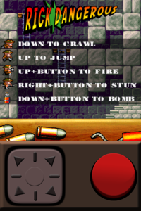
Do the opposite of everything they say

Do the opposite of everything they say

2. Interace

As far as the visual interface is concerned, there are no real issues.  The audio quality is bad however, the opening samples are hissy, and I wonder have they been lifted from the original Amiga version.  If so, it seems a bad decision to make.

3. Interaction

This is where it all goes wrong.  The ability for the player to accurately control the character is almost non-existent.  You’ll know in your head exactly what you’ll want to do, but the chances of that plan succeeding are almost zero.

The main reason is the developer’s decision to use fixed controls at the bottom of the screen. Whereas most iPhone developers have realized that a virtual joystick is a better method, allowing the player to control movement wherever they place their fingers, these devs have fixed the location.   This means that if you’re trying to move the character right for example and your thumb moves out of the joystick region then the character stops. Usually resulting in another life lost. This means you constantly have to glance down to see where your thumb is, and if it’s near an edge (which it will be), then readjust its position. This takes your attention away from the game and turns Rick Dangerous into a ‘where is my thumb’ game, a new genre of game granted, but not a good one.

Fixed area of control - disaster

Fixed area of control - disaster

This is a game built around pixel-perfection, the timing of jumps and shooting needs to be very accurate, so this game just doesn’t work with the current interaction method. Even simple tasks such as climbing a ladder causes immense frustration with the character stopping near the top for no reason, but not actually reaching the top.

Jumping requires the player to move their thumb onto one of the upper diagonal directions, trying to do this in an accurate way it just impossible as your thumb is likely to move over the left or right directions first, causing you to move into the object you’re trying to jump over.  And loose another life of course.  The large button should probably be a jump button, and possibly another dedicated button needed for weapons, basically anything apart from what they have come up with.

4. User Experience

UX comprises many factors. For gaming, a key component of UX is the fragile line between challenge and frustration. If done correctly, this produces a satisfying gameplay experience, constantly challenging the player, but not making them feel overwhelmed.  Sadly, this does not do any of that, it’s frustration all the way.  The best I managed was to reach the third screen, and there was no fun to be had along my journey.

Playtests

It’s a shame really, the developers are clearly technically competent, the port looks just like the original, but the feeling is far, far different.  It’s as if they had no understanding of the iPhone’s interaction methods and somehow thought that just by implementing the old-style controls would be enough. I think it’s also painfully obvious that they didn’t do any user testing, and from my point of view at least, that’s unforgivable. If a company doesn’t care about the people who are going to play their game, then they mustn’t care about making a financial return on the game either.  It must be nice to not have to worry about that bothersome activity of earning an income.

Lessons

The company, Magic Team, have joined my list of iPhone developers to avoid at all costs, they have ruined a perfectly good license and worst of all is that it could have been fantastic.

At least this disaster of a game can serve as a warning to other would-be Amiga porters; when you port, please don’t port the interaction methods also.

PEGI ratings – the trouble with icons

This week TIGA, the trade association that represents UK and EU video game developers said that more work was needed to make the new PEGI game rating logos more recognizable.

Icon design is incredibly difficult, when done well it can transcend language barriers and culture issues, but when done badly, it results in delays, confusion and wasted mental effort.

These new warning icons are designed to guide parents when choosing a game to buy for their kids. I decided to do my own evaluation of the icons and so yesterday I took to the streets to ask the good people of Brighton what these icons meant.  Here are some of the responses.

PEGI icon Guesses “Don’t know, worldwide, more than one person, needs access to  computers”  Actual meaning, online.

Picture 5-1 Guesses “Violence, fighting, breakable (as in Wiimote danger)”. Actual meaning, violence.

Picture 5-2 Guesses “Swearing”. Actual meaning, swearing.

Picture 5-3Guesses “Phobia warning, caution, don’t know, would put me off buying it,  contains spiders”. Actual meaning,  fear.

Picture 5-4 Guesses “For boys and girls, suitable for all sexes”. Actual meaning, contains  sexual content.

Picture 5-5 Guesses “Drugs, hospital”. Actual meaning, scenes of drug use.

Picture 5-6 Guesses “Don’t know, doesn’t mean anything, socializing, parent caution,  multiplayer”. Actual meaning, scenes of discrimination.

Picture 5-7 Guesses “Game of chance, competition, gambling, entertaining”. Actual meaning, gambling.
Overall, only the swearing icon was interpreted the same by everyone, the next clearest were violence and drug use, followed by gambling.  Worryingly, 4 of the 8 icons completely confused the people I asked, no one understood what they were trying to convey.  Everyone I asked were UK nationals, I would be keen to see how these are interpreted in the rest of the EU.

In my admittedly rather limited tests, the PEGI ratings scored 29% accuracy, so I fully support the TIGA recommendation to make these icons more recognizable.

Apple-Centred Design

It’s commonly known that Apple took inspiration for the first Mac interface from Xerox Parc, however I don’t have a problem with this for two reasons. Firstly, they took concepts that were in a research lab and turned them into a successful commercial product, in the process creating a revolution in the computer industry. Secondly, they improved upon the original ideas, refining the rough edges to deliver a pleasurable user experience for all.

Since then, Apple have lead the way in innovation and design, constantly delivering products that move the computer industry forwards.

Design Process

What’s interesting about Apple is that they don’t appear to look to others to copy from.  If they use competitive analysis design techniques then it’s more likely to be ‘make sure we don’t do that’, rather  than ‘make sure we do’.  The launch of the iPhone instantly made the world think if Apple could do this with their first ever attempt at a phone, then what have the other phone manufacturers been doing all these years.  If I were a mobile phone maker on 29th June 2007 I would have been embarrassed.

There hasn’t been much said about Apple’s design process, it’s not quite clear how they get it right time after time.  Despite their products being driven by the user experience, it does not seem apparent that they employ user-centred design techniques, the more obvious answer is simply that they have the best talent working for them.  A senior engineer at Apple reveals some details here

Of course it’s much easier to follow than to lead, at least it should be, but it’s always amusing to follow the ‘me too’ attempts from other computer manufacturers.  Let’s look at two recent examples.

Microsoft

Microsoft’s preview of Windows Mobile 6.5 revealed many ‘borrowed’ interface and interaction techniques from the iPhone.  This in itself is fine, Microsoft are renowned for copying features from OS X for example, but in true tradition, they make everything worse. They’re like a bad photocopier where each copy makes a worse version of the original.

Throughout Windows mobile 6.5 preview, the presenters mentioned that they took a user-centred design process.  I didn’t see any evidence of that, but did think that they took an Apple-centred design process.  This process simply involves looking at Apple products but then adds one final MS step which states ‘and make worse’. It’s bad enough that the MS design team have no capacity for original thought, but they don’t even appear to be able to analyze existing products.

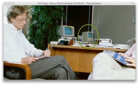
MS have always said that they don’t copy Apple, however watching a documentary on Bill Gates I was surprised to see an early photo of Gates and Balmer in a meeting, complete with a Mac Classic in the corner.

Microsoft using Apple-centred-design

Microsoft using Apple-centred-design

Dell

It’s not just Microsoft of course who take inspiration from Apple, surprisingly even Dell want to be seen as design conscious these days. They recently revealed their Adamo laptop, an attempt at copying the MacBook Air. The Apple-centred Design approach for the Adamo is obvious enough, it’s a very poor copy which looks terrible as you’d expect from Dell, but for me the more interesting attempt at Apple-centred Design was in the marketing of  the laptop.  Take a look at this Dell Adamo video then compare it with the original Apple video
At first I thought the Dell ad was a joke, the amateur production, poor script, the lead designer fumbling through a description of the inspiration and passion for the laptop, laughable.  Then 30 seconds into the video we see the care and attention that Dell have lavished on this machine when it’s taken out of a classic Dell brown box.  It seems Dell’s attention span didn’t quite reach to the whole user experience, I suggest their design team do an unboxing of a MacBook Air as soon as possible. It’s not the same at all, is it?

ACD justified

I can understand why both of these companies copy Apple’s design and marketing approaches, because when left to their own attempts at original thought, Microsoft give us the Churros ad and Dell give us ,well, anything that Dell produces.

Windows Mobile 6.5 – first thoughts on the UI and interaction design

Microsoft recently gave a demo of their upcoming mobile phone OS, Windows Mobile 6.5, at the Mobile World Congress Conference in Barcelona. The keynote lasted one hour and can be seen here http://tinyurl.com/d59acl or you can look for shorter demos of the OS on YouTube such as http://www.youtube.com/watch?v=F-w9fP6terY

Keynote introduction
Balmer gives the introduction, he says the focus is on UX and new interaction techniques. Worryingly he says they’re bringing the PC experience to the mobile, but I’m not quite sure what this means.  Designing the user experience for the desktop and for a mobile platform should be very different, and the Windows experience is not exactly a model of UX that you’d want to see anywhere else anyway.  Not a great start.

Throughout the talk, the words innovation, interaction and user experience are repeated, however just saying the words does not make it true. I found no presence of innovation in Windows Mobile 6.5, it definitely seems like they’ve tried to bolt on touch capability to their existing OS. I found more innovation in Apple’s iPhone cut and paste feature than in the whole of this Windows Mobile demo.

This keynote covers three aspects:
1. Windows Mobile 6.5 – the new OS
2. MyPhone – the web service to manage your phone.
3. Windows marketplace – the app store for the phone.

Andy Lees comes on stage, a senior VP at MS.  He shows a promotional video. Even in this promo video the interface lacked elegance. Flicking between photos causes the image to simply appear, no sense of gesture or physicality which the iPhone offers. This also happens on the Home screen, the user issues a command via a gesture, but the result just appears as if a mouse click has been issued.  The response does not match the style of the input.  No thought, no care.

1. Windows Mobile 6.5

Next up is Prithvi Raj, he says the new OS “brings my work life and personal life together”, previously Windows Mobile has been business focussed, clearly they want a slice of the iPhone market.

He alleges that the team have done user research, for example they have discovered the three reasons why people pull their phone from their pocket. From their pocket? Does this mean they only asked males? Most females I know do not keep their phone in their pocket.  I presume he really means, ‘all the engineers on our team look at their phone for one of these reasons’, or even worse ‘I take my phone out of my pocket because …’.  I’m starting to doubt their research approach, regardless, the reasons people look at their phone (according to MS) were:

1. To know the time
2. To find out where should they going (next appointment)
3. To find out why has their phone been buzzing / beeping in their *pocket* all day long. Pocket again?

What I find interesting about this is that all three reasons are to check or read back stored information (time, appointments and missed calls / text), not to actively use the phone.  Also, these reasons seem more in line with older mobile phone use, not smartphones.  Not sure I fully trust these results or how they were obtained.

Lock Screen

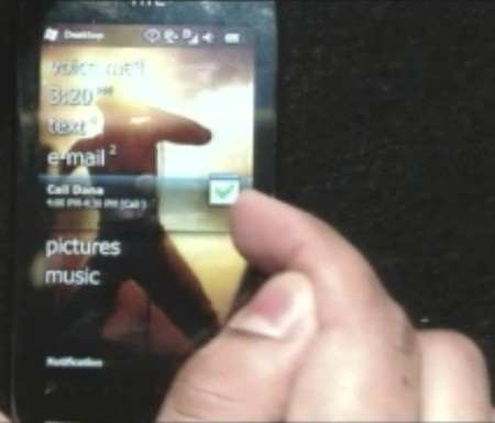
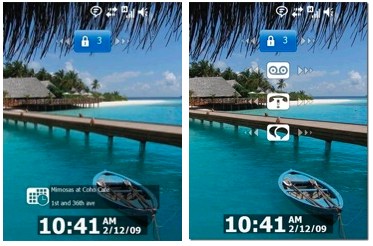
With their ‘user research’ completed, they have made use of these findings to inform the design of the Lock screen. This screen shows the current time and the user’s next appointment, but to see why their phone has been buzzing, the user has to click another button at the top of the screen. When they click this, any missed calls or texts appears, but their next appointment disappears. So, after all that user research revealing the top three reasons why people looked at their phones, Microsoft’s design makes it impossible to see all three at once on the screen.

Despite user research, only 2 of the 3 key items are viewable at any one time

Despite user research, only 2 of the 3 key items are viewable at any one time

One observation worth noting is that the unlock slider is at the top of the screen, this means you’ll need to use two hands to do an unlock (one to hold the phone, one to swipe), not one like an iPhone, as it’s slider is within thumb reach. Also, when trying to unlock the phone, the slider didn’t follow the user’s finger, it only goes part of the distance.

Home screen

Once the phone has been unlocked (similar to Apple’s swipe gesture to unlock), we are now in the Home screen.  The Home screen is the user’s landing screen, where they can get access to all their information.  The first thing that strikes me is that this is a textual list, it doesn’t look like an inspiring place to spend time, nor does it make the phone particularly usable.

The Home screen, lack of usability and satisfaction

The Home screen, lack of usability and satisfaction

Let’s stop and contrast this with the iPhone. The iPhone home screen has a grid of icons, each is identifiable by it’s spatial position, colour, and missed calls / texts are highlighted with a red badge. MS have went with a monochrome text-based list which means the user has to click and hold their finger until they’re over the menu item they want.  This approach results in slower navigation and fewer items the on-screen at once, so more scrolling for the user.

I know this is beta, but the visual style was unbelievably terrible, the text message screen look like a screenshot of a compuserve bulletin board from the ’80s.  Again comparing the mail app to the iPhone reveals how the iPhone uses appropriate use of colour and meaningful information, the Windows mail app lacked usability and user experience.

Start screen

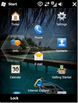
Not content with the Home screen, MS think we need another, er, home screen.  This one is called the Start screen and seems to be like a graphical version of the text-based Home screen.  Confused by all the screens?  Turns out it’s not just us,  I watched several presentations on YouTube from various MS staff and many of them have confused the name Lock screen with Home screen or Launch screen or Start screen. Typical MS, confusion over simplicity.

The Start screen features a honeycombe design, but I can’t see the research justification for this.  The iPhone allows 16 icons per page, plus the 4 permanent apps at the bottom, the honestcombe design only allows for 9 to be viewed at any one time.  This must result in more unnecessary scrolling, and may also make it difficult to remember exactly where an icon is, i.e. “I know it’s in the middle somewhere, but not sure exactly”, versus the iPhones “I know it’s on page 4”.

All Windows phones will have a windows hardware ‘home’ button on them. Organizing the icons is not as easy as the iPhone, the only option seem to be to move an icon to the top or bottom of a page, but no ability to place them where you like, which is important as once you get more apps, you may want to cluster them by usage or category.

The Start screen, a graphical version of the Home screen?

The Start screen, a graphical version of the Home screen?

Calendar

Raj demonstrates his calendar and steps us through his day by swiping each event in turn. This seems more complex than the iPhone solution where your day is presented as a list with all events in view. So to me the Windows mobile calendar seems to take longer to access and reduces the viewing of my appointments to one item at a time rather than by full day. User research?

E-mail

In the e-mail app, we still see scrollbars down the side, on a mobile device why would you do this? Have they learned nothing from previous criticisms of Windows Mobile? This is a mobile app, screen space is a precious resource, they could even have resorted to their usual tactic of copying what Apple do only making it worse (topic of next blog). The top of the screen also looks cluttered with meaningless monochrome icons, complete with a Windows desktop X button in the top right.

In the e-mail app the presenter says that you can move between e-mails by swiping across the screen. In true MS style, the page just appears, not like the photo browser on the iPhone where your swipe feels like a physical action as the image is given momentum proportionate to your swipe speed.

IE

Again, Andy Lees says it’s the same expereince on mobile as the desktop as it’s the same IE engine. Flash is supported, a direct shot at the iPhone, however it seems to be Flash Lite which is not well regarded (i.e. useless). Lees states that 40% of people are *confused* as to what they’re seeing on the mobile screen compared to the ‘big screen’. Not sure what he means, is he saying because Flash is not supported on mobile devices? I’d like to know where he got this figure from, one place springs to mind.

An IM comes in during the demo and one of the presenters says ‘I hear a beep’. A beep? Is that how important audio is to them?  He could have said audio notification, audio alert, auditory icon or similar, but no, a beep.

Contacts
When scrolling through the contacts list Raj says that he prefers to look for people by their picture rather than their name because it’s easier. If that’s the case then why do you have the text on the Home screen and not icons? Let me guess, different teams worked on different apps and the team lead has no idea about consistency or UX?

Text messaging

It is possible to respond with voice, but I guess only to certain supported clients?. What is the user need for this? It can also send messages to Xbox 360 users in-game. Have they ever watched someone enter a text message using the Xbox interface, it’s torture.

Interaction – Finger Stylus

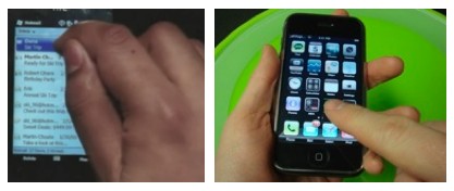
I find it interesting to note how the Raj in this case uses his finger for interacting with Windows mobile. In most cases he has turned his index finger into a stylus by steadying it with his thumb to hit the small icons and target areas. iPhone users use their finger flat, hand down and natural. They may say that the new Windows phone is touch enabled, but it certainly isn’t designed for the natural ergonomics of the human hand.  I will call this Microsoft interaction design method Fingus (Finger as a stylus).

Compare hand ergonomics, MS on the left, Apple on the right.

Compare hand ergonomics, MS on the left, Apple on the right.

2. MyPhone

MyPhone is the web companion service for your Windows Mobile phone. It offers 200MB to backup information, but the iPhone for example has up to 16GB, why offer a backup service that doesn’t backup all your stuff?  Seems like there’s potential here to loose data, i.e. I thought it was backed up, but MS’s app didn’t do it.  He says if you loose your phone then you can get a new one and all the data is restored, but how if you can only backup 200MB?

They give an example of adding a picture to someone’s contact details from the web, but the iPhone makes this really easy right on the device. Why are they showing me this, they’ve just proved how much worse their apps are than Apple’s?

27m 07s into the video, his phone freezes and has to resort to a backup phone. Great stuff. All that was missing was a BSOD on the mobile.

3. Marketplace

Users don’t have to go to Marketplace for their apps, but they might. Scenarios please?  They then show a video of customers endorsing Windows phones, senior people at Samsung, HTC, Sprint, Toshiba and Orange among others. I’m just waiting for The Onion to make a spoof based on this promo video.

Balmer says there are over 20,000 apps that run today (legacy I presume). I don’t care about these, I want apps that are designed for these touch phones.

Conclusion

Lees says that cutting edge design, innovation and user experience are very important, but I really do fail to see how any of these have been demonstrated today. All I saw in this demo was a poor imitation of a product that really did deliver on all three of those criteria. He goes on to say that the device need to be optimzed for mobile content, but the MS presenters have been harping on about how they are bring the same experience from the desktop to the mobile. Can these two companies agree on their design direction? He says MS and HTC are working closely together, I have to wonder.

Microsoft say that it is easy to identify a Windows Mobile phone in stores as we’ll see the Windows flag on the device, as least they’ve made it easy for us to know which phones to avoid.

Microsoft Songsmith – why?

I love music, really, it’s as important to me as food, air, or my Apple Mac. At age 10 I thought it was what I’d end up doing with my life. My job during my undergrad years was playing in a band, so I could say (tentatively) that I’ve been a professional musician at some stage in my life. However, I’m well aware of my limits, and I recognize that I don’t have enough talent to make a living performing. Having at least an approximate grasp on your limits is important, will I compete in the Tour de France this year, enter X-Factor or start a new career in pro-wrestling? The answer to all is sadly no.
Nowdays I’m an academic, I work on new approaches that helps make video games better, and I understand the difference between an application that is intended for research purposes and one intended for commercial release. It appears that Microsoft don’t however.

Songsmith is a ‘music’ application that came out of Microsoft Research Labs, but I just can’t work out why it’s made it to commercial release. My first exposure to the app was not the terrible muzak that it generates (more on that later), but the publicity ads surrounding the product. Scoble interviewed the two Microsoft engineers (see video below), and like most of the videos covering Songsmith, I found this terribly painful to watch. I felt like a kid watching Doctor Who all over again as I had to watch this video with my hands covering my face, peeking through my fingers now and again. The key difference being that Doctor Who made me scared, Songsmith induced agonizing embarrassment. If there had have been a sofa in my room, I would have been behind it.

[kyte.tv appKey=MarbachViewerEmbedded&uri=channels/6118/307754&tbid=k_2826&premium=true&height=500&width=425]

Let’s rewind to the beginning. Songsmith is an app that let’s you sing into your computer’s microphone, it analyzes the recording and auto-generates a backing track according to some preferences that you set.

UI and Interaction
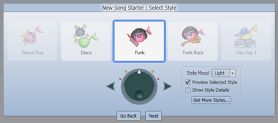
I feel that Songsmith does everything wrong. Everything. If I have an idea for a song in my head, I want to get that idea into the computer as quickly as possible. Not so with Songsmith. On launching the app you have to choose your style of song, then choose the BPM. How on earth anyone knows the BPM of what they want to record is beyond me. One of the ways of interacting with the UI is using a jog-wheel or dial approach, this made me scream out loud while trying to use it. In the Scoble video one of the engineers talks about how easy it is to use, I sense he’s toying with us.

Step 1 - choose your song style, but avoid the dial

Step 1 - choose your song style, but avoid the dial

Why you need two methods of interaction, both jog-wheel and the cursors is beyond me, the app already looks terribly old-fashioned, do they think dials are jazzing it up? After choosing the song style you have to then choose your BPM. I laughed when I first saw this, then shouted, then shouted some more. Both the UI and interaction for setting the BPM is nothing short of bewildering, none of my HCI students would design something as bad as this.

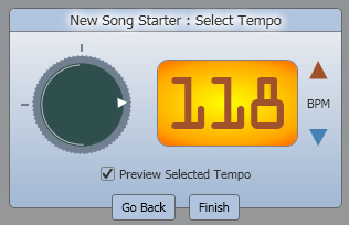
Step 2 - choose your BPM, if you know, care, or actually are able to.

Step 2 - choose your BPM, if you know, care, or actually are able to.

In the choose BPM dialog, again there are two methods of interaction, the dial or cursors. There is almost no reason I can think of for having the dial here, it is very confusing to understand and control, and will almost certainly slow down the process. Nor does it add to the user experience, so how this made it past user testing is a mystery.
As for the interface itself, we can see there are two markers on the outside of the dial, is it obvious what these are? These are the maximum and minimum values of BPM, the value at the 12-oclock position is the min and the one at 9-oclock is the max. Obviously they don’t state what these values are, nor is obvious to me how the values should be chosen using this method. Is there not a common UI component that already exists that defines a numeric range and makes it easy to set a particular value? Oh yes, it’s called a slider and is also commonly found on music interfaces. Far too usable apparently, best to choose the infuriating option which makes users guess how it works.

Laying it down
We finally arrive at the recording window feeling enraged and have probably forgotten the tune that we were thinking of. Regardless, let’s record something. The first few times I hit record I wasn’t able to start in the right place, the count-in completely confused me. Once that was mastered I found singing-along to only a metronome completely, well, uncreative. After recording my vocals I was finally able to listen back to the joy of the auto-generated accompaniment. The final output is torturous, nothing else can describe it. The output seems to be using MIDI which was a protocol designed to primarily control audio equipment, and has as much potential for expressing emotional sound as Yoko Ono. Everyone else has mostly abandoned this approach for generating music, or do it very well and combine it with high quality samples (Garageband).

With vocals recorded, I explored the rest of the interface. I noticed a button labelled “Undo [1]” and when clicking it, it erased my vocals – with no ability to redo. Genius. I would suggest a better approach may have been to, oh I don’t know, how about actually tell the user in plain English what they’re undoing, e.g. Undo vocal recording? Programs like Adobe Lightroom tell the user clearly what steps they’ve performed and which they can roll back to, again MS take the ‘let’s make it completely confusing’ approach, which is always best for novices using these programs.

I don’t even know who this app is aimed at. The promotional videos show young kids but when I was using it, quite complex chords appeared, why would they care what a C#sus4 chord is?

Do potential users know or care what the chords mean?

Do potential users know or care what the chords mean?

Coda
So there we have it, Songsmith is an app which is infuriating to use, shows music syntax that is meaningless to novices, makes them answer pointless questions before they can record, will never be used by musicians, and the output would be terrible even 20 years ago. I doubt anyone on the dev team was either musical or had any awareness of usability. In the Scoble video they mention user testing, frankly I find this hard to believe, or another possibility was that the user testing wasn’t even conducted properly (i.e. our other engineers with no musical ability loved it too).

I suggest before this research team release any more products they ask themselves one question, “What would Steve say?”.